Two of a Kind
1 Article, 2 Designs
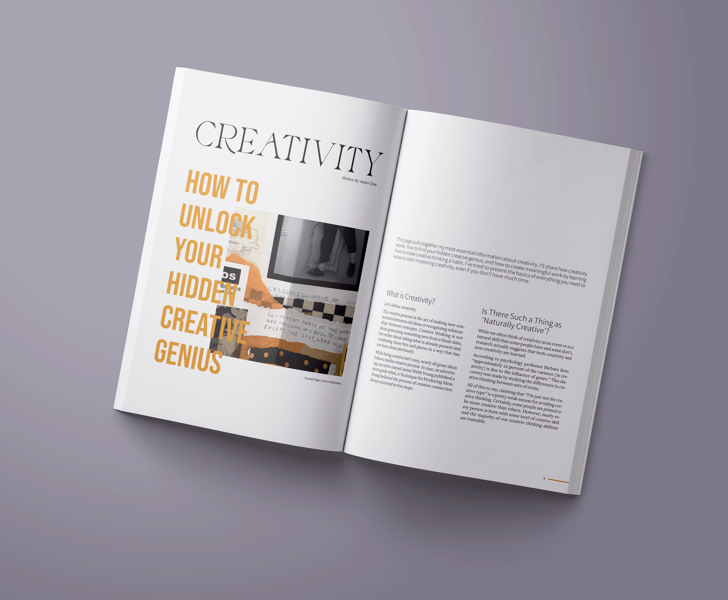
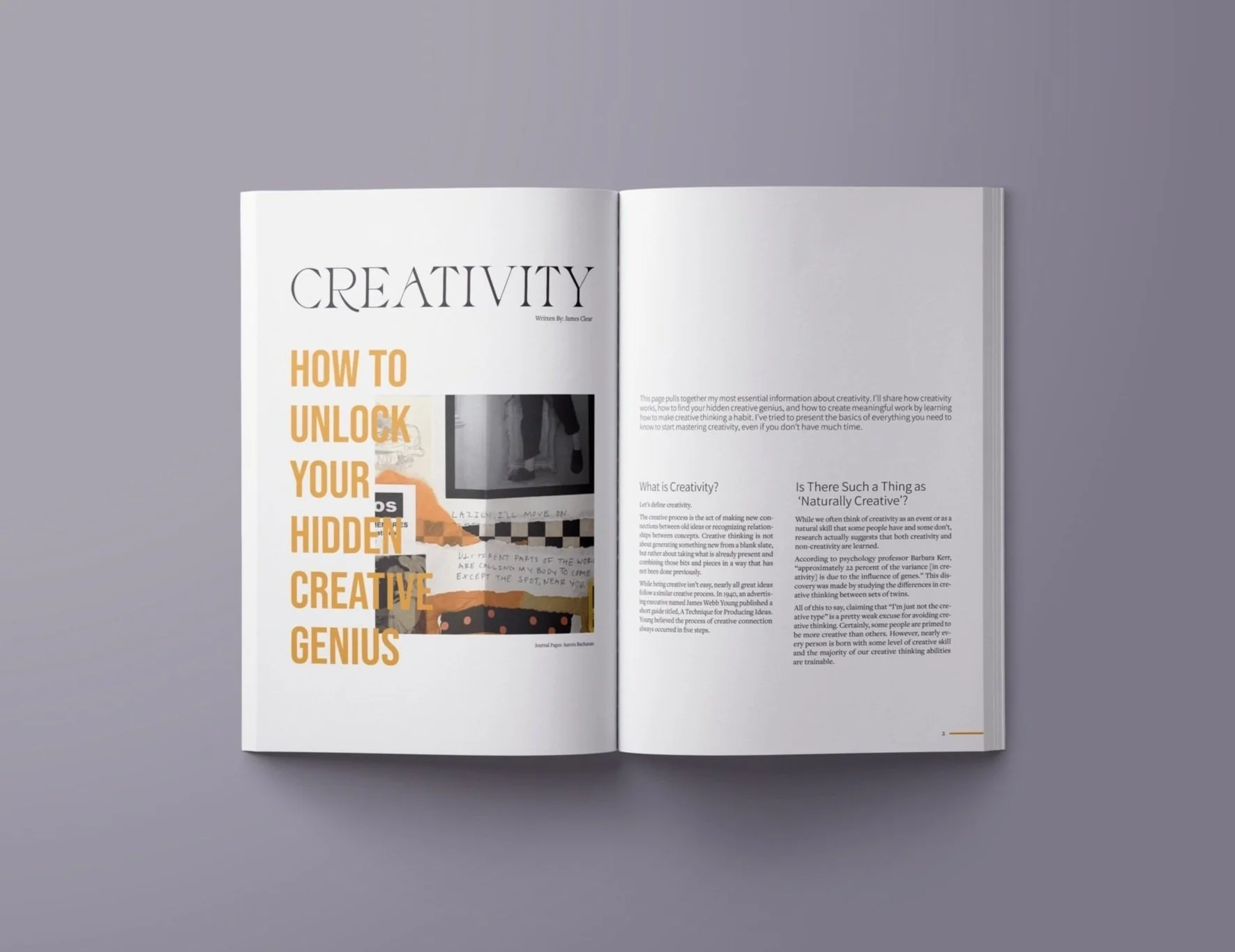
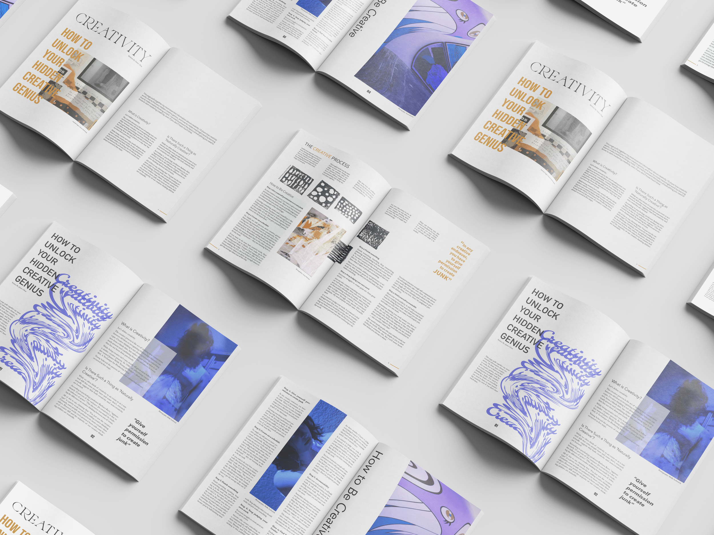
Diving into the world of editorial design, Two of a Kind features one magazine article laid out in two unique ways. The article used for this case study is “Creativity: How To Unlock Your Hidden Creative Genius”, by James Clear. Each magazine style focuses on specific design elements and a concentrated color palette.
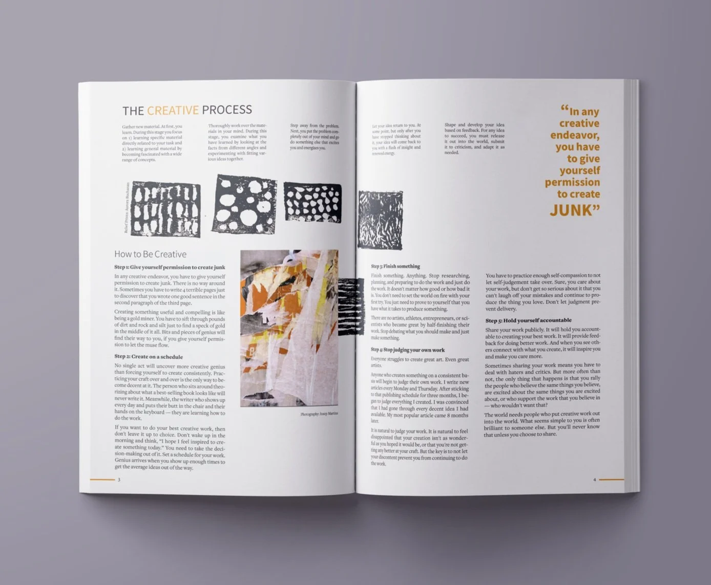
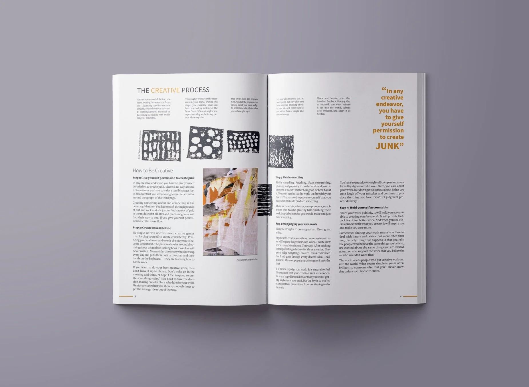
The first spread focuses on the use of texture to create dimension that is then paired with a clean typographic layout for the article content. The spread takes on a sleek, modern, and edgy look for these design executions. A concentrated color palette of oranges, reds, and yellows is extracted from the photographs and then incorporated in the typography. Negative space is applied to compliment and allow textured photographs to be the focus.
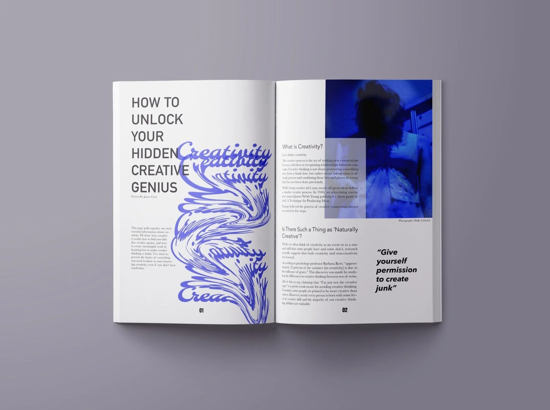
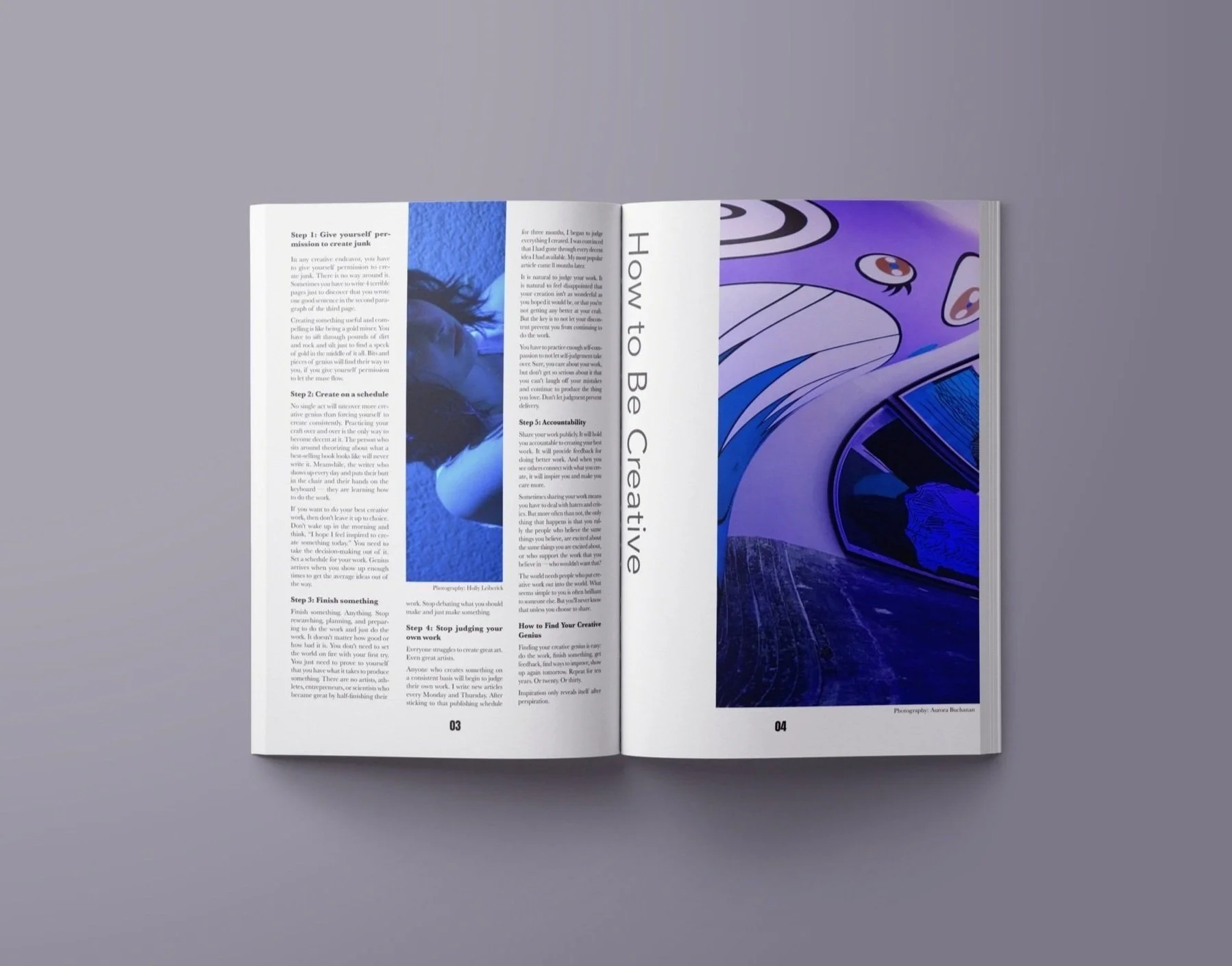
The second spread focuses on the use of line, and the movement it creates within included type treatments and photography. A controlled color palette of blues is achieved by the manipulation of photographs and then applied to typographical elements. An overall feeling of playfulness is paired with a modern and clean article layout that creates pleasing contrast within the spread.